Table of contents
What is PlnatApp.org
I started working on www.plantapp.org in 2021. My goal was to build a protein sequence-centric database (but not only) for comparative genomics in plants with an easy-to-use interface. As a starting point, I focused on using the primary protein sequences that are curated by the JGI Phytozome plant genome database. I am in the process of updating the database to include an even more comprehensive set of protein annotations, gene familes, sequences, orthogroups, best-blast-hits and genomic coordiantes. You can find which datasets are currently on available on PlantApp through this link.
More recently, I have been putting together a large amount of re-analyzed transcriptomic data. Currently, there is CPM data for over 2,000 RNA-seq samples from 7 plant species. The data can be visualized through different interactive figures and the raw count and CPM data is available for downloadmore.
Annotations
The PlantApp database contains different types of protein annotations across multiple plant genomes.

Profiles
Gene expression plot

Gene expression heatmap

Mutual Rank-based coexpression

Apps
More information about the different apps will be provided in the future through the following link:
SimpleTree
Build a simple protein-based phylogenetic tree from a list of gene IDs. Press the example button to see how it works.

Protein Alignment
Generate a simple and interactive protein alignment from a list of selected gene IDs. The genome graph is generated using a Dash app. Press the example button to see how it works.

Genome Graph
Build a simple genome graph showing the location of selected genes across the genomes. The genome graph is generated using BioPython, and currently only supports Arabidopsis and Maize, although adding support to more genomes is simple. Press the example button to see how it works.

GO Enrichment
Run a quick and simple GO enrichment analysis from a list of selected gene IDs. Press the example button to see how it works.

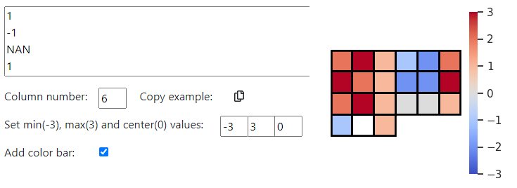
Mini-heatmaps
The mini-heatmaps plotting app was inspired by the gene pathway and gene family heatmap visualization produced by MapMan. This can be useful for visualizing quantitative changes in any group of genes. I used an sns heatmap and then added a rectangle to cover empty cells. Although it works fine, if I had the time, I would re-write to just draw the individual rectangle to make a cleaner figures. Press the “Copy example” button and paste the example data into the text box to get the mini-heatmap. Replacing numerical values with NaN will color the cells white.